Visual Cognition Lab
Improving the usability of my lab's website.
While a student at UC Riverside I worked as a Research Assistant in the Visual Cognition Lab. While working there I noticed that our website could use some updating to provide a better experience for the lab’s participants.
My goals were to make information more accessible, provide an accurate representation of the current state of the lab, and give the lab a new brand identity.
Timeline
June 2020 – September 2020
More than aesthetics
I knew that the website needed to undergo some UI changes, but I also wanted to find areas where the experience could be improved. To do this I asked myself questions such as:
- What is the primary action of a visitor?
- How can information be better organized?
- What information is most important on initial landing?
Interviewing lab participants
I was lucky enough to be able to talk directly with the main users of the lab’s website: lab participants. While doing my daily calls for recruiting participants I would ask questions about the website. I was able to identify what parts of the website needed to be reformatted.
Throughout my time working in this lab I was able to interview dozens of participants. I felt that I had a good outline of the directions that I wanted to update the website.
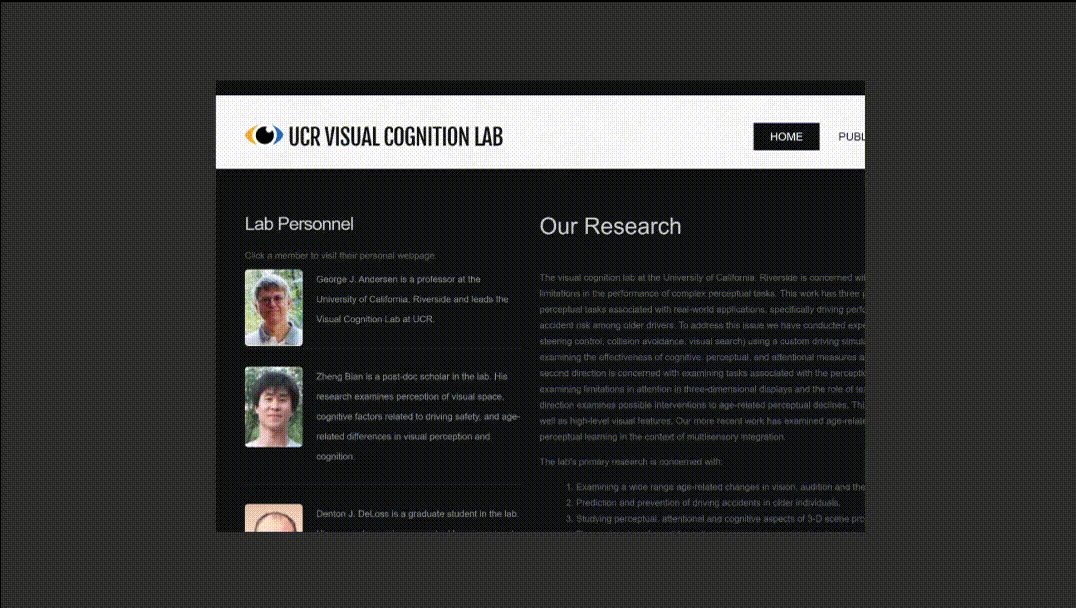
Original website
All pages of the old site were reviewed to see what content needed to be kept, removed, or reorganized. Along with reviewing design elements the purpose and functionality of the site were evaluated.
Refreshed interface
There was a complete overhaul of the website’s designs and layouts. Design decisions were based on feedback received from previous phone call interviews.
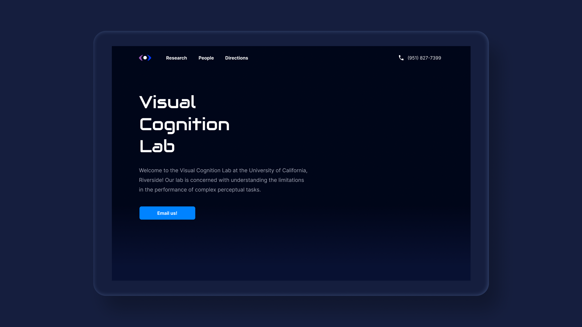
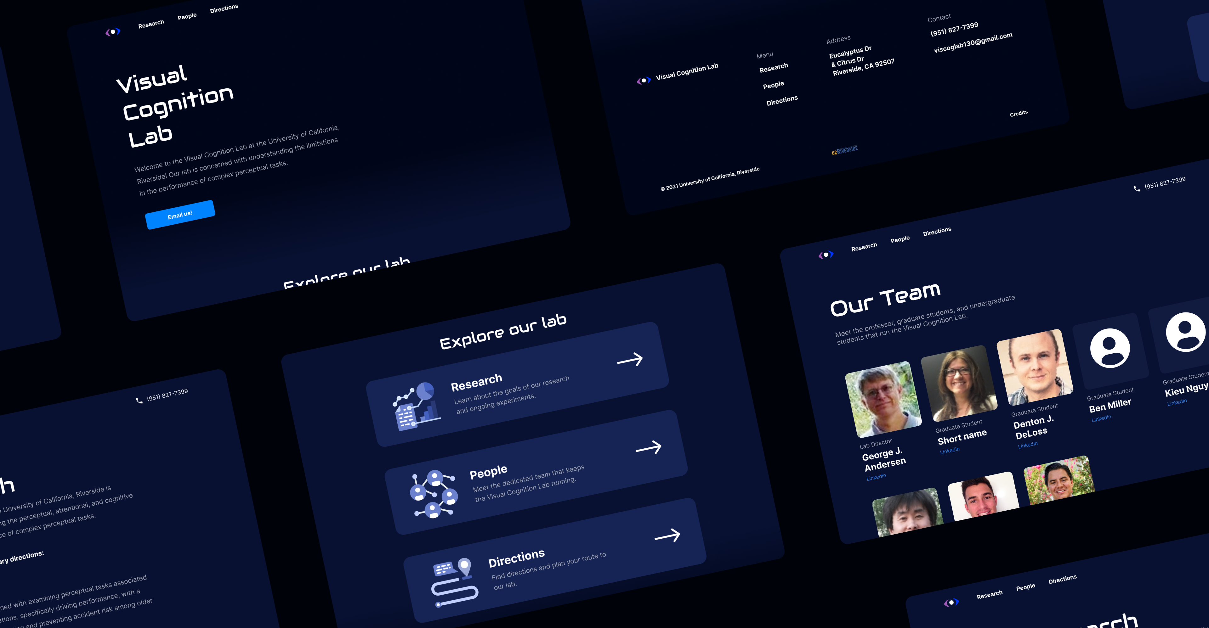
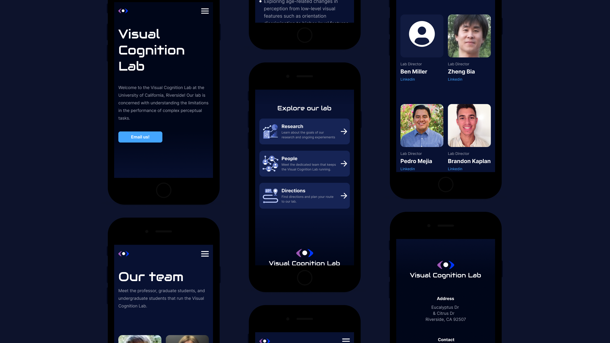
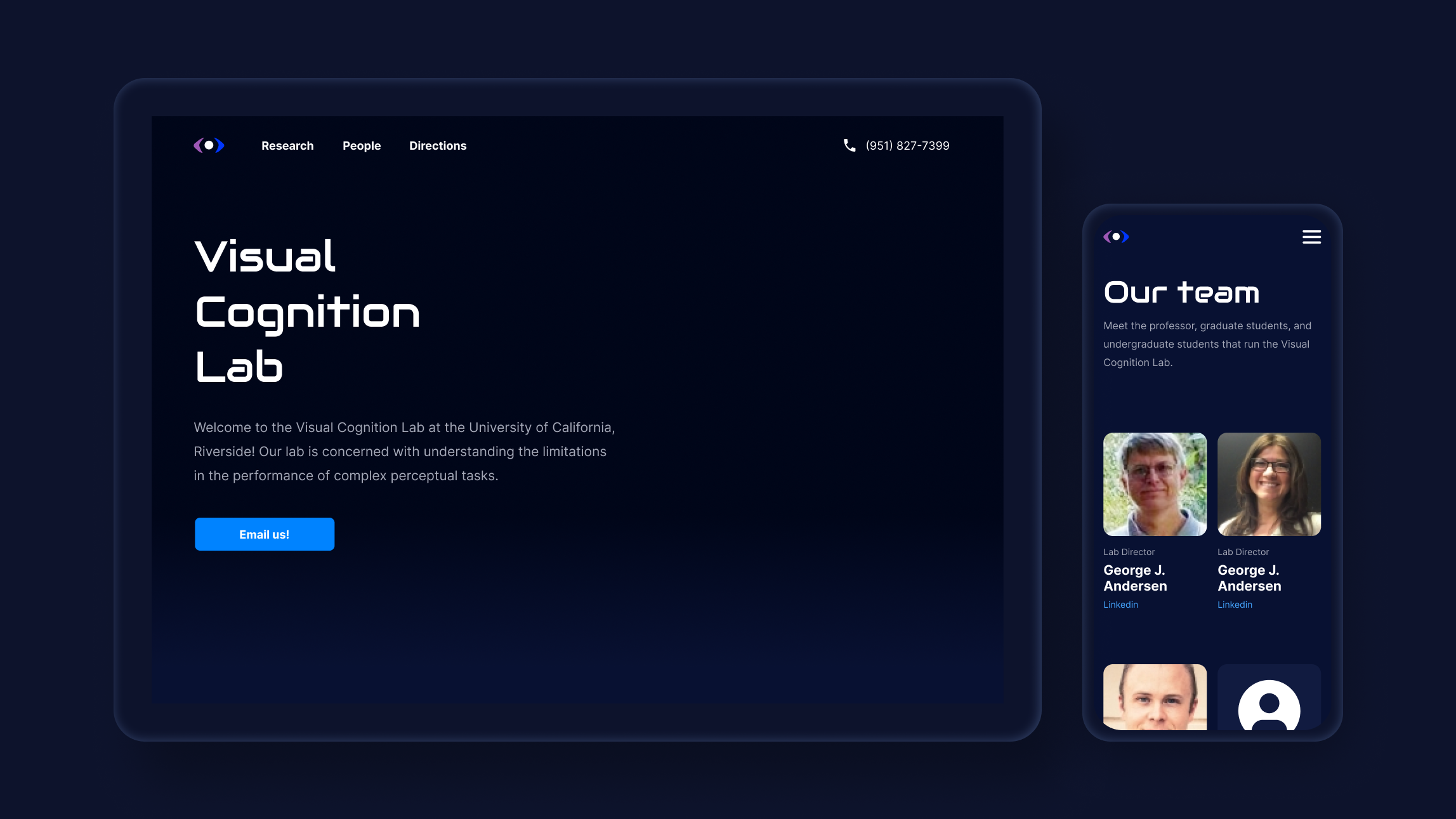
Relevant homepage
Based on information gathered from interviews, the hero section was designed to have content that lab participants needed; the lab’s phone number, a way to email the lab, and direction information.
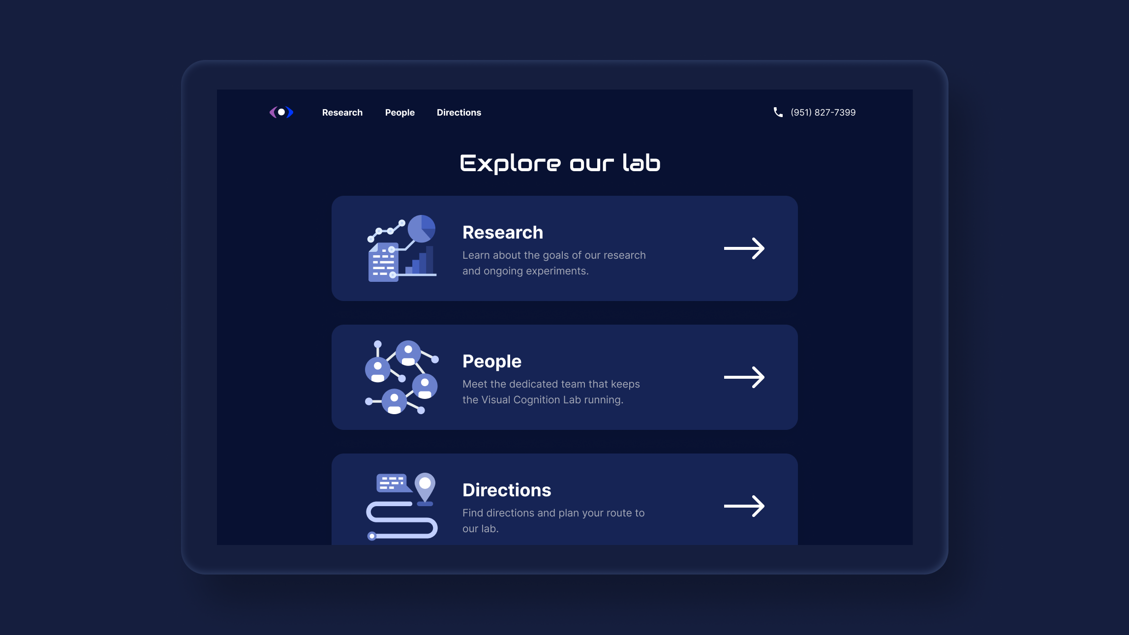
Easier navigation
Previously the homepage was cluttered with information. These cards display what content is available on the site while allowing an easier way to access it all.
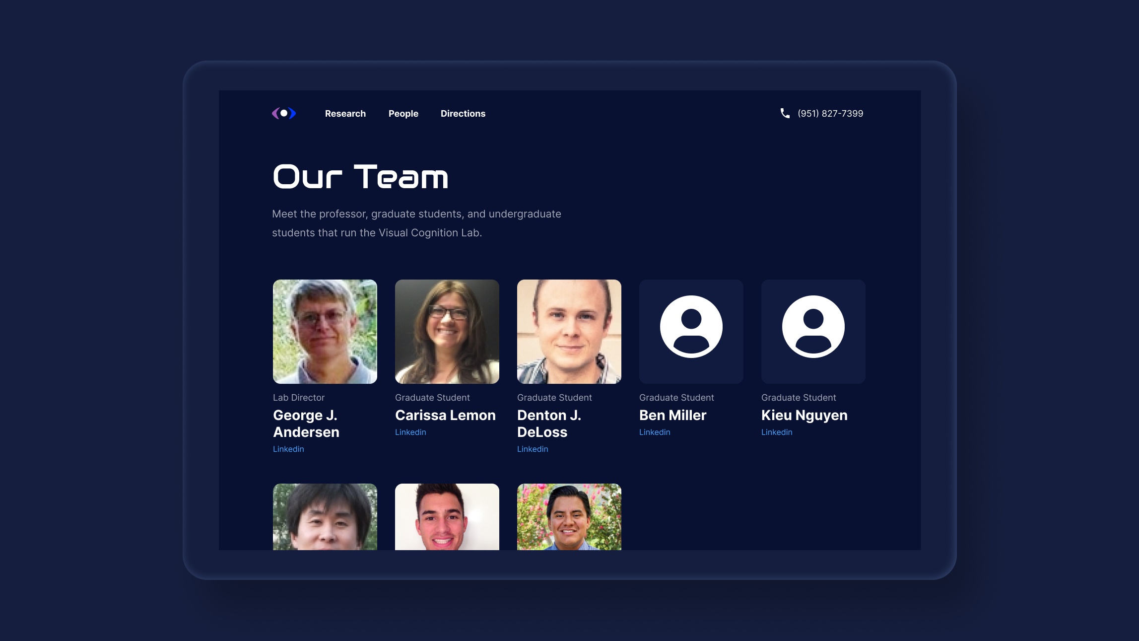
New team members
Updating the People section to include all of the new graduate students and research assistants gives an accurate representation of the current state of the lab’s personnel.
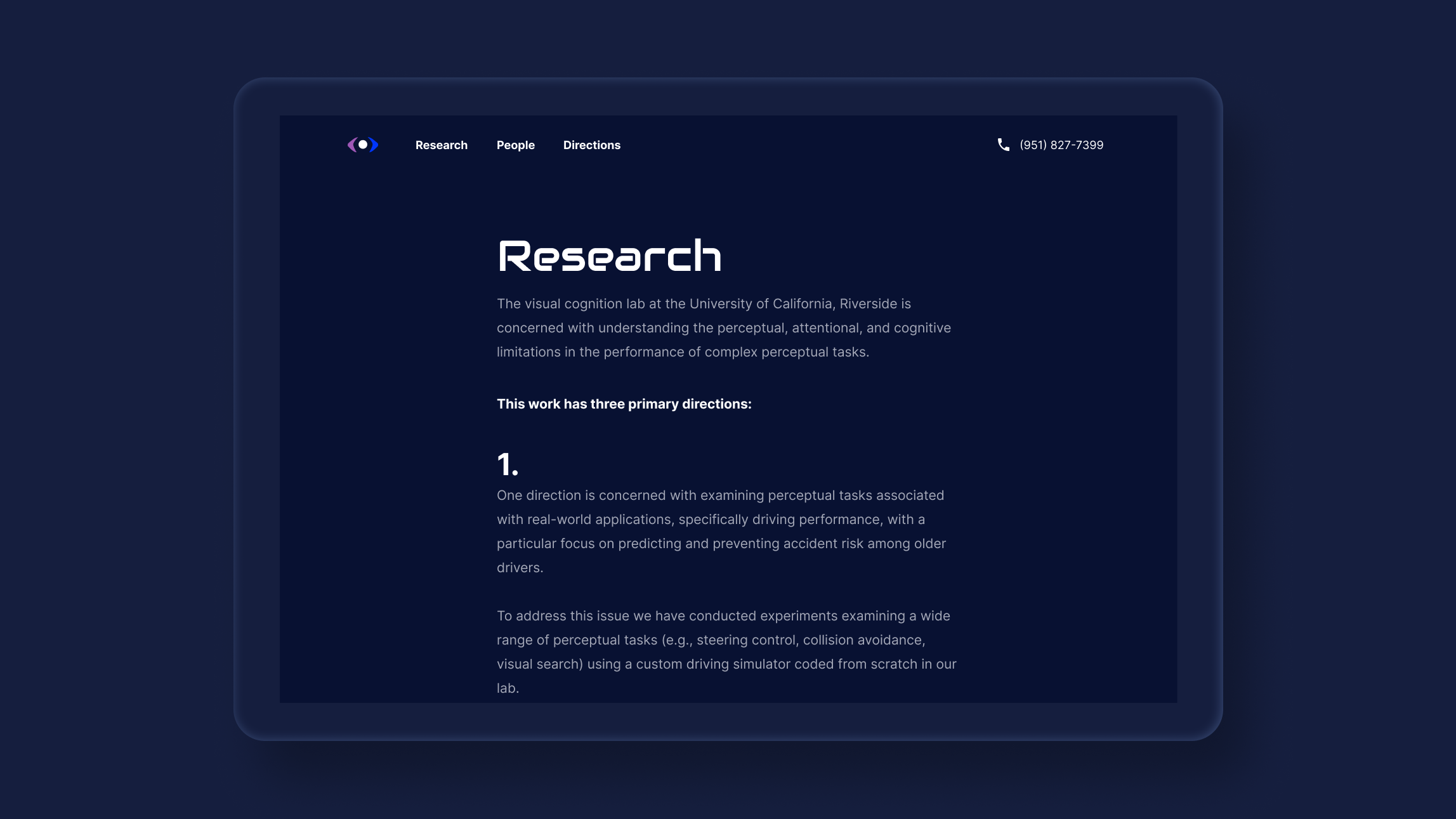
Scannable content
To make the research section easier to read and more visually aligned the overall width was shrunk, text color was changed to fall within contrast guidelines, and paragraph headers were used to make the information more scannable.
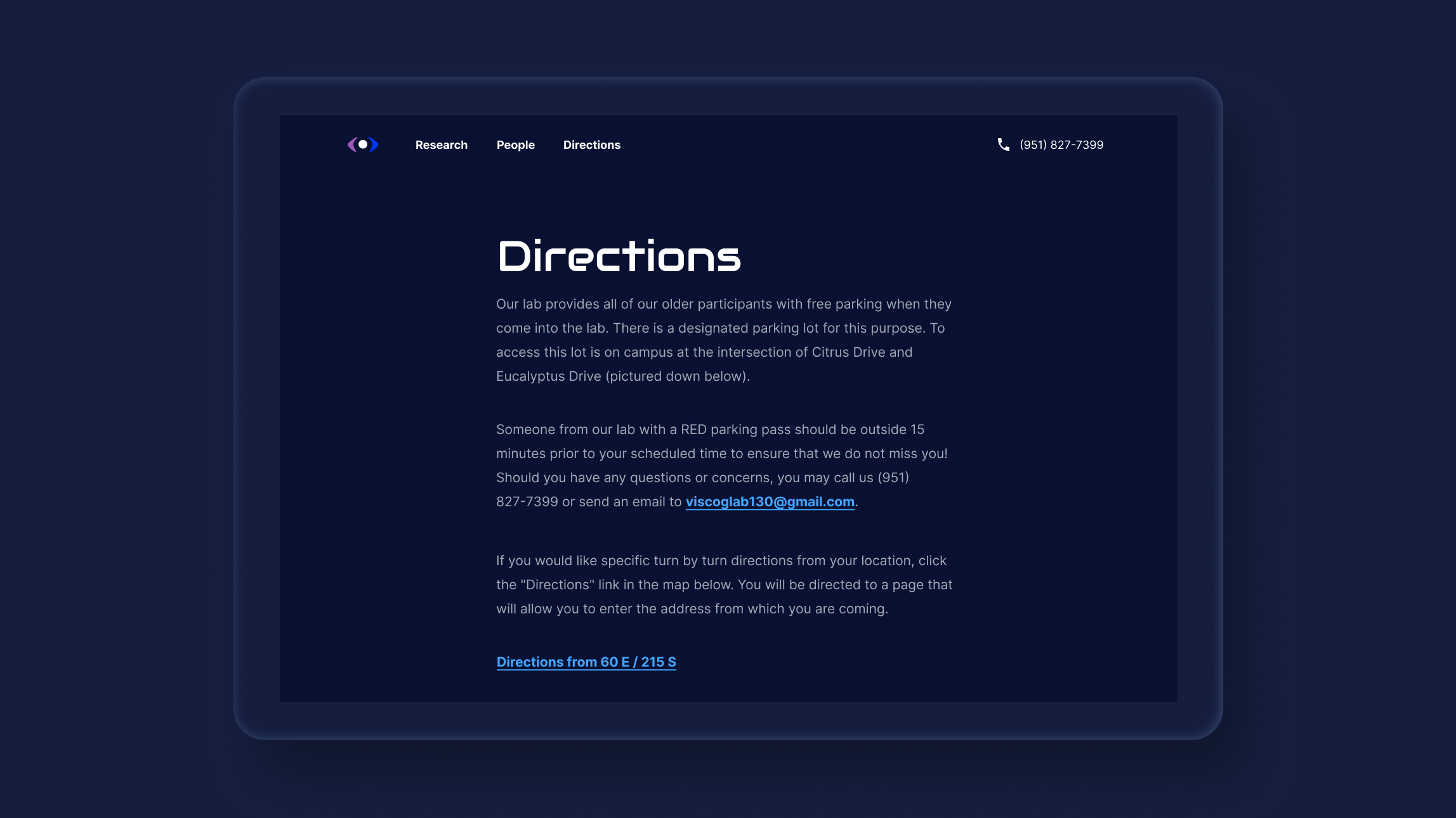
Consistent interfaces
Going to the Directions previously rerouted you to a different URL with an entirely different interface. This was fixed by keeping this section within the same URL and applying the same styling as the rest of the website.
Lab identity
Establishing a visual identity for the lab with consistency throughout all pages of the site was crucial to the redesign.
Accessible anywhere
Previously the site was only optimized for desktop. Making the site easy to use on mobile was crucial especially for the directions section. Accessing directions to the lab while in the car is a key situation that the previous designs did not cater to.
Learnings
- Talk to real people. Conversations I had with lab participants provided invaluable information as to how the lab’s website was being used. Those insights gained while talking with real users of the website would have been more difficult to discover through other methods.
- Take initiative. The previous site had existed for quite some time in the lab and things had run in the lab smoothly. But I saw there was room for improvement. Could the lab have run just fine without a new website? Probably. But I figured it was worthwhile to explore improvements upon a key aspect of how people interact with the lab; the lab’s website.
Next steps
These designs are currently being coded and should be ready for publishing soon.