ConnectOurKids
Building mobile tools for social workers.
ConnectOurKids is an organization that aims to connect foster children with a permanent home. Their organization provides free tools to social workers to help expedite their work.
Our team was tasked with taking the main tools and features of the ConnectOurKids website and converting them into a mobile app. We had weekly meetings with the CTO of ConnectOurKids.
Timeline
Dec 2019 – Feb 2020
Website
How do social workers use ConnectOurKids?
Before jumping into designing mobile layouts it was necessary to define the product that ConnectOurKids provides. By exploring features on the website and using information given to our team by the CTO we were able to identify the 4 main ways social workers utilize the ConnectOurKids tools:
Search databases
Document activity
Edit contact information
Team communication
Reviewing existing designs
The desktop tools were reviewed in-depth to make sure we transferred all necessary components. For each feature of the ConnectOurKids website notes were made of the layout, typography, colors, and flows. This review helped us brainstorm ways to convert the layout to mobile and find areas to incorporate improvements in the designs. Here are the desktop versions of the two main tools:
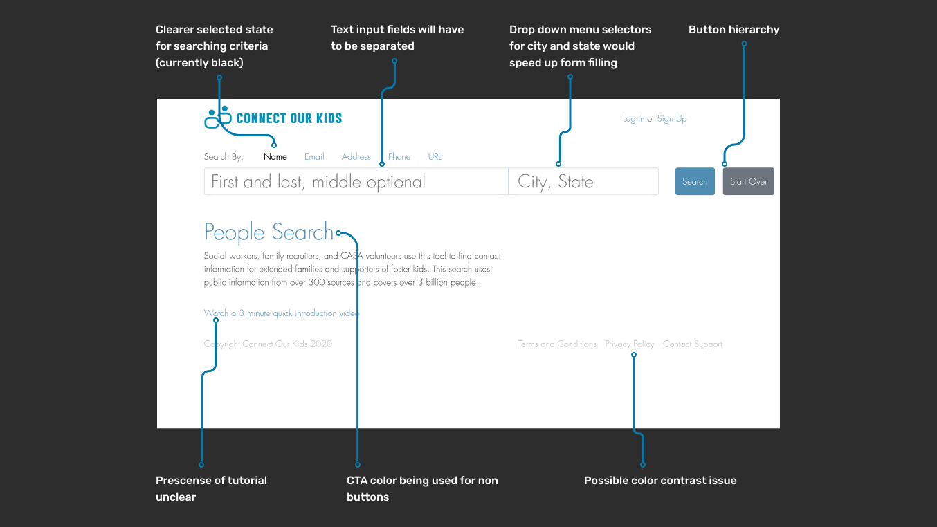
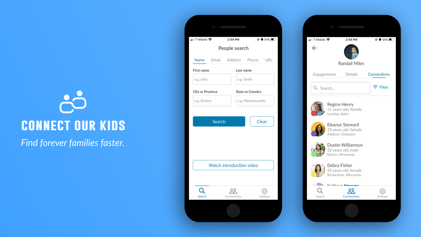
People search
People Search is the way social workers find the extended family of foster children. Potential candidates for a permanent home can be located through here
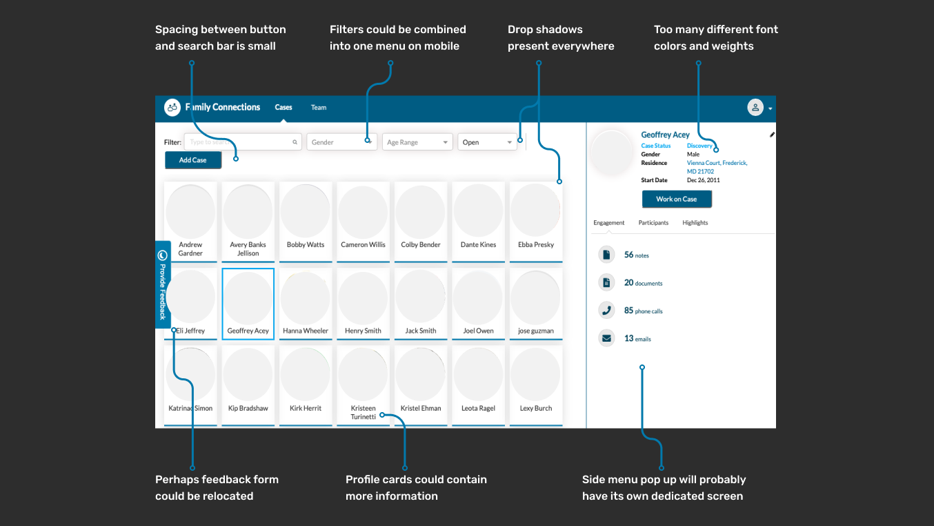
Family Connections
A family connection is anybody related to a foster child that has the potential to be a permanent guardian. The Family Connections tab contains the files and any other associated information for a foster child. Social workers can log past engagements, upload documents, and edit contact details here.
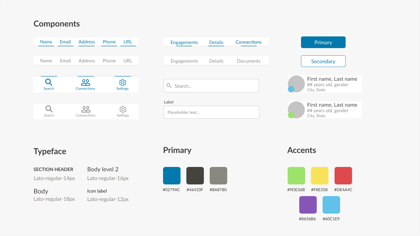
New design system
Our interface choices were based on the design elements already present on the website. We did not want to reinvent the wheel and have the app’s UI vary drastically. So, to keep the experience similar between the website and mobile app we used the same copy, color schemes, typeface, and navigation layout as much as possible. Although, some of these aspects were changed to improve overall consistency, clarity, and hierarchy.
Our goals for creating a new design system were to:
- Create components that could transfer to desktop easily
- Reduce unnecessary text and color styles
- Have consistent UI across all tools
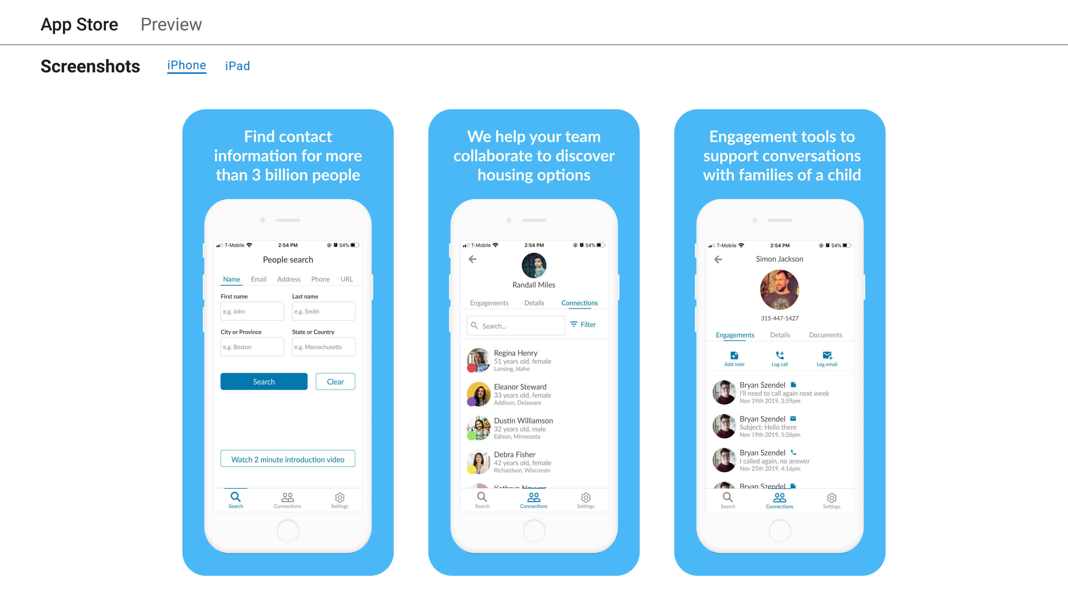
Creating a mobile experience
Taking into account all notes made from the website review and the updated design system we were able to craft the mobile experience. Inconsistent navigation UI across pages, font colors, and several shades of blue were updated with reusable components and fewer styles.
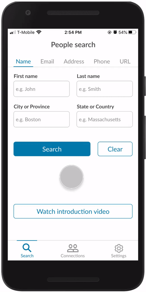
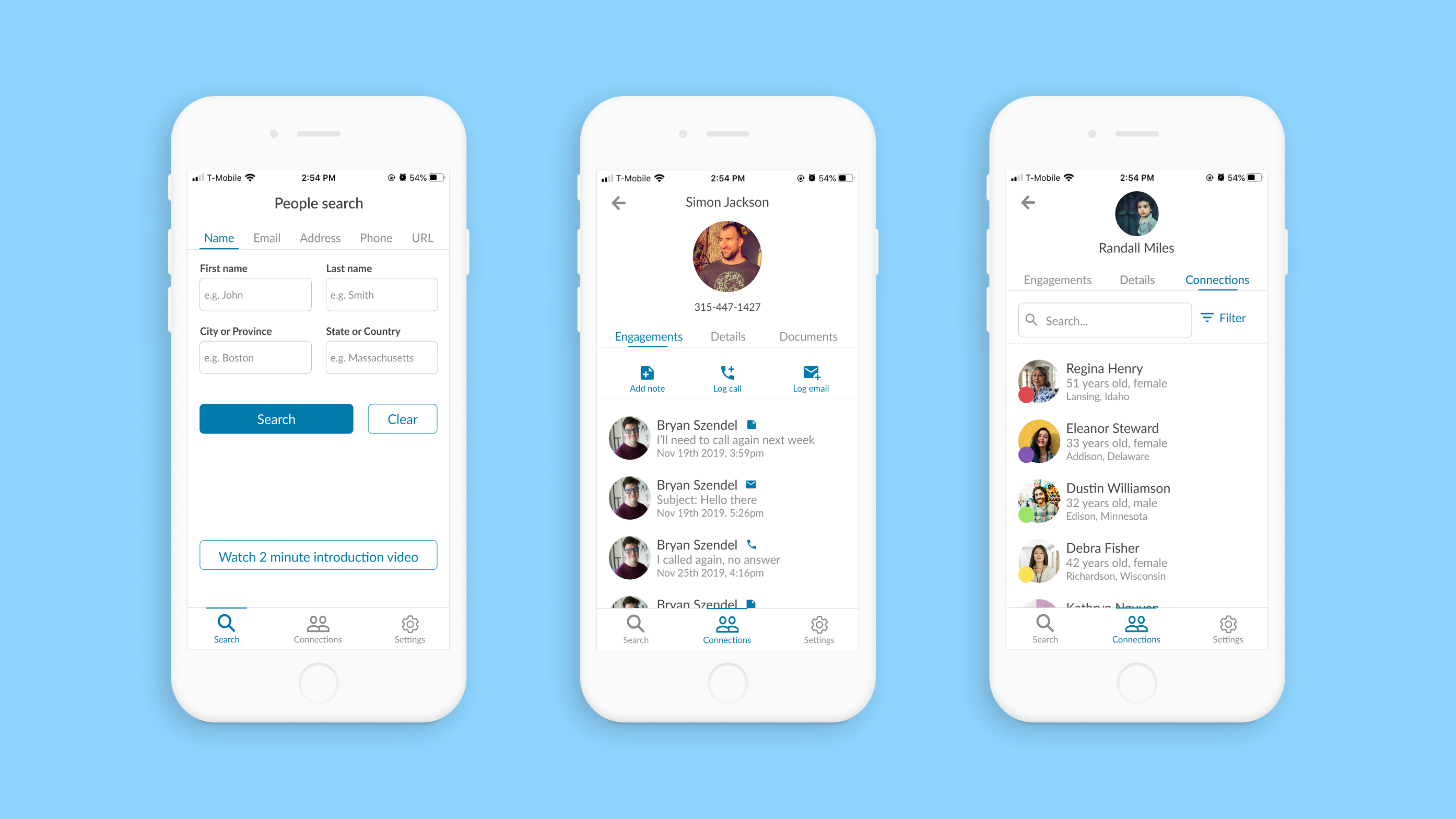
People Search
Search results are displayed in a pop up allowing for a quick return back to the search home. The tutorial button was redesigned to have better visibility.
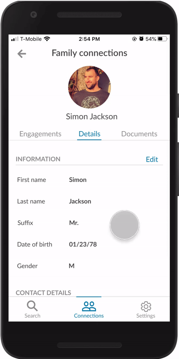
Editing Family Connections
The Family Connections section contains all information related to contacts for a foster child. The information in the editing screen was divided into sections to make finding particular information faster.
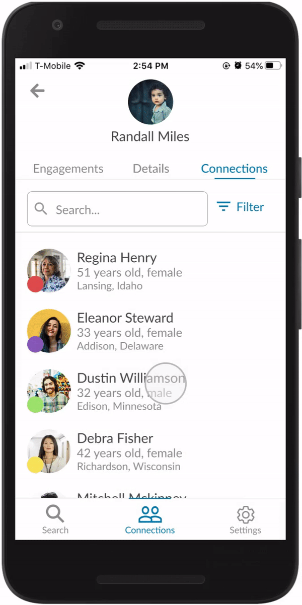
Organizing Family Connections
This is a new feature we designed exclusively for the mobile app. A color filtering system was put in place to make identifying different types of family candidates easier.
Measuring success
How do we know if the app is providing value? These are some metrics that I would want to look into after the app has been released to determine how much value social workers are getting out of the app:
Permanency percentage
A child being placed into a permanent home is the ultimate goal. Broader reach and mobile tools will hopefully result in a more efficient workflow. Comparing the numbers for the percentage of foster children placed into permanent homes before and after the release of the app can give us a clear idea of how effective the app is.
Family connections discovered
With social workers having access to family connections in a mobile setting we would expect an increase in the number of family connections.
Social worker feedback
App reviews can provide useful insight into how the tools are being used. Are they providing value/making social worker’s jobs easier? Is there room for improvement in terms of functionality? Of course, we would want to see all positive reviews, but the negative reviews will reveal pain points that users are having and allow for the improvement of the app.
Future directions
Moving forward and thinking about ConnectOurKids as a whole I think a good direction would be to update the website to the same level of design consistency as the app. The issues found regarding color schemes, typography, reusable components, and interactions on the website were left untouched on the website.
Updating the desktop tools will create a more consistent experience between desktop and mobile which would hopefully translate into an easier workflow for social workers.